For Lovers of Coffee
Zoma Beanz
Zoma Beanz is a new coffee company that specializes in ground and whole bean coffee. They have a light and a dark roast blend. They are currently not distributers anywhere but are looking to grow their business opportunity in store.
DESIGN PROBLEM: To design a coffee company logo and branding material for adults between 18 to 50 years of age. To make a simple but stark logo design that will stand out among competitors on the shelves in stores. We wanted to focus on the two types of coffee that they offer and for which the company was built on.


DESIGN PROCESS: I researched coffee companies that are currently in store to see how our design would stand out. A lot of those companies use brown and black in their logo along with very readable typefaces. The name Zoma Beanz was the company name that the client asked to use. I chose to use the common brown colors because it was important to the two styles of coffee they offer. Light brown for their light roast and dark brown for their dark roast.
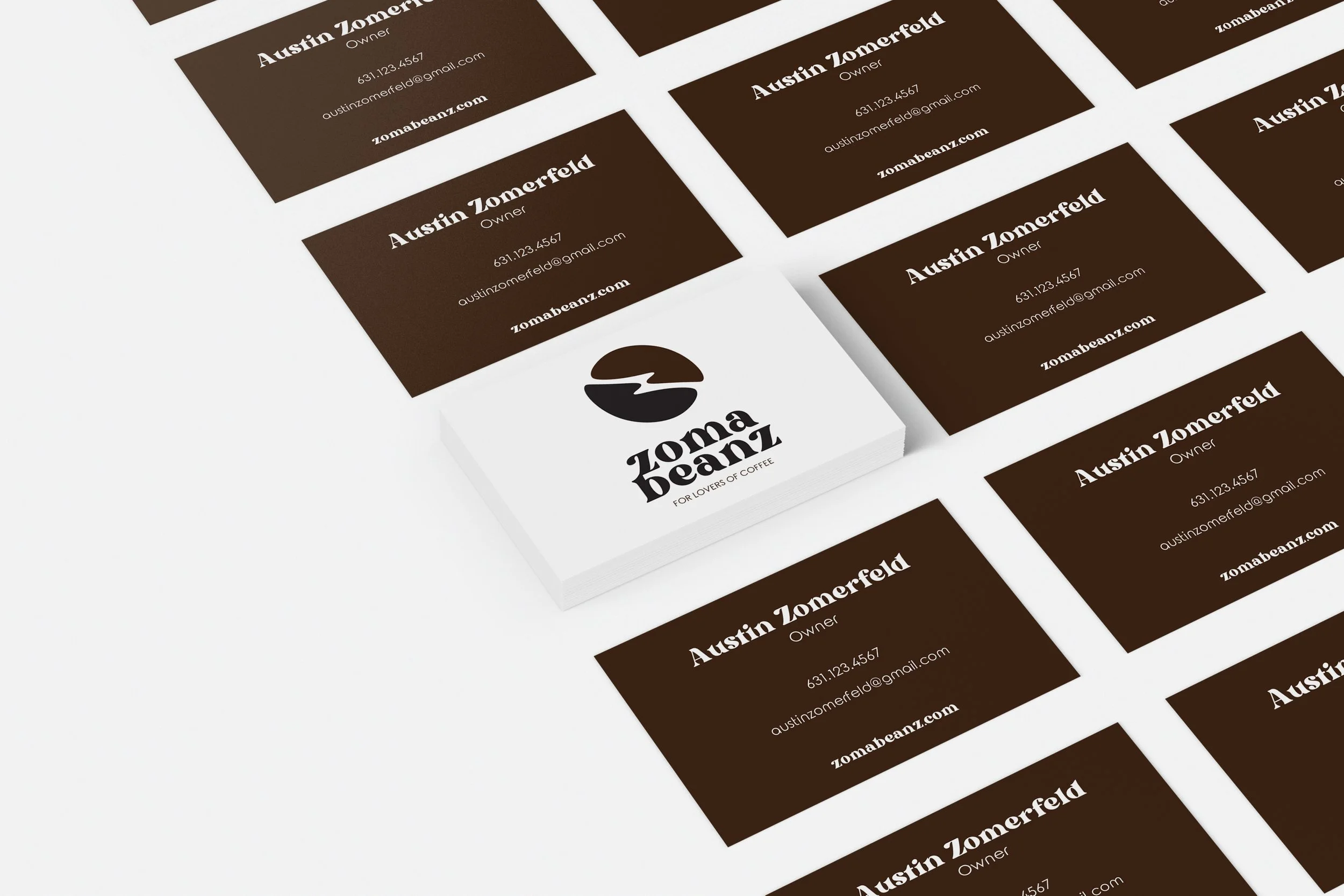
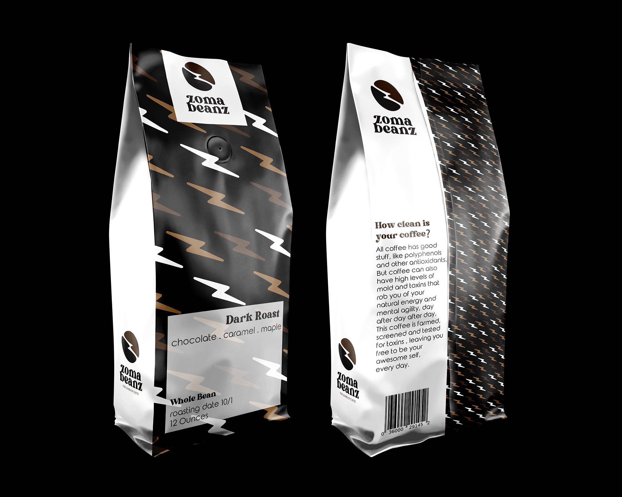
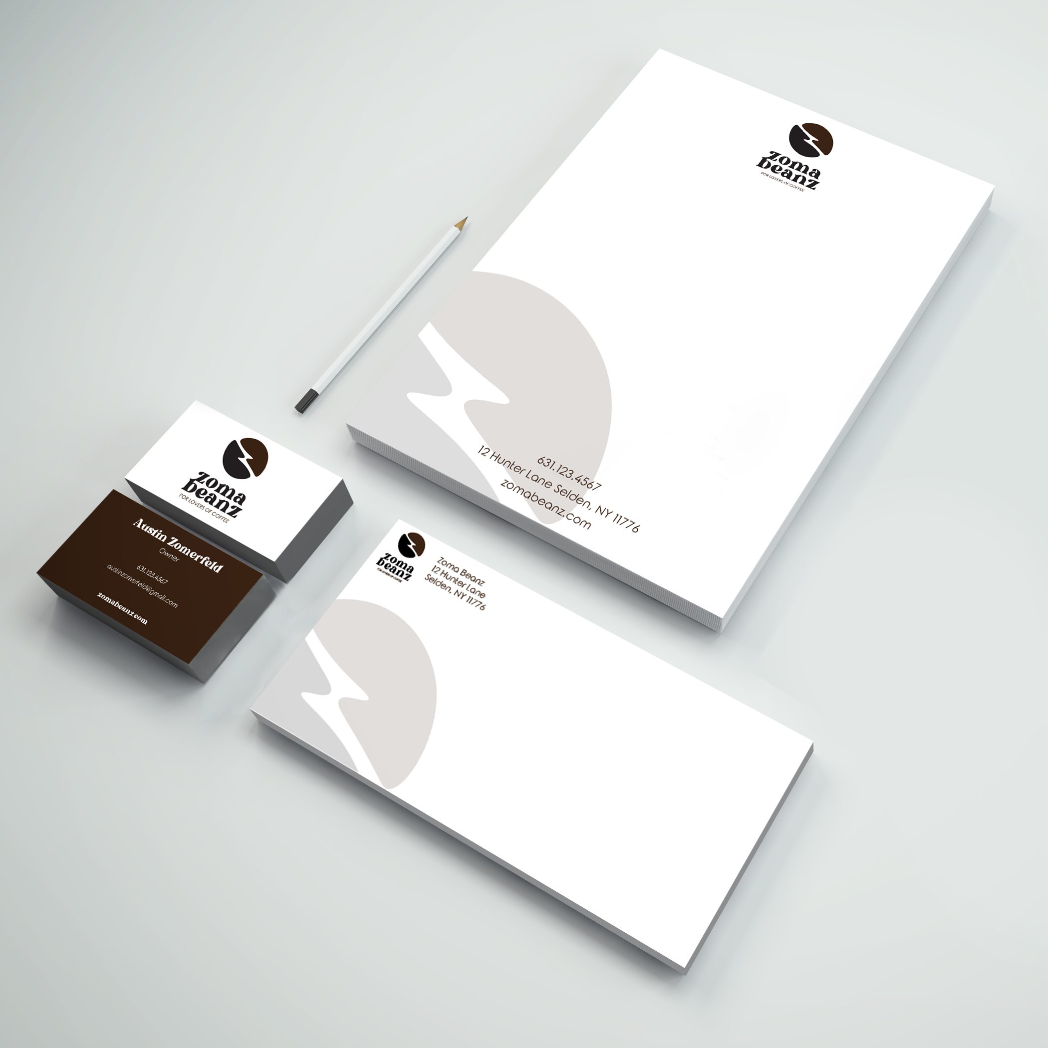
DESIGN SOLUTION: The main icon for the brand is a coffee bean with a visible Z running through the middle which stands for ZOMA. I also wanted this to resemble a jolt of lightning. I wanted to use a more serif and characteristic typeface to be able to stand out as well as a bold and strong looking typeface to showcase the taste of their specific coffee styles. For their brand I wanted to create a whole branding package which includes a logo, stationary set, packaging design, and a promotional piece.
SOFTWARE: InDesign | Illustrator | Photoshop

