

You can’t live a full life on an empty stomach.
Whitney in the city
Whitney Schurr is a food blogger in St. Louis, Missouri. She tries new food and restaurants in the area and blogs about her experiences. She doesn’t rate the restaurants but points out what she loved about the atmosphere or food.
DESIGN PROBLEM: To design a logo that showcases what Whitney does as well as calling to action her Instagram account which is the platform she uses to blog about her experiences. She wanted to incorporate food and St. Louis specifically. To further build her brand, she wanted to create a website that would match her logo and draw people to her website so she can further show her food and restaurant recommendations. She was also working on starting an annual restaurant crawl for her followers and asked for a poster design, that she could post digitally and around the city.


DESIGN PROCESS: I followed @whitneyinthecity on Instagram to get a better feel of what her followers see and what her online presence is like. She is very bubbly, and her personality comes through when she posts about food. She seems very well liked in her community and it shows by how many followers she has. I wanted to keep that light and bubby personality intact by keeping the colors bright, fun, and playful. I looked at St. Louis landmarks that would be noticeable to the viewers and easily decided to go with the St. Louis arch. As part of her rebranding, Whitney took the early designs we had and posted them on her Instagram and let her followers vote on which they liked best for her new brand look. The final logo design was the clear winner which solidified Whitney’s choice.
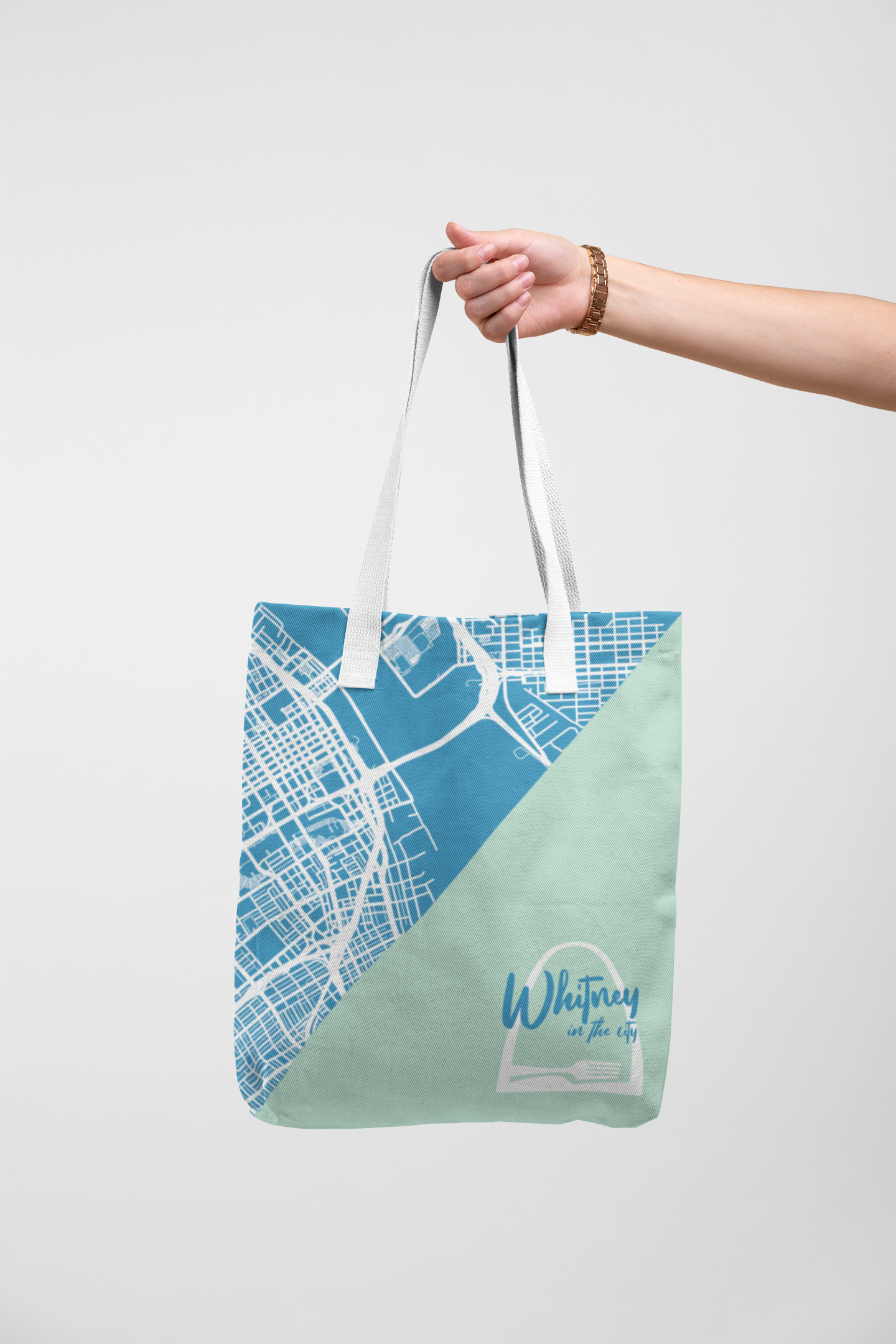
DESIGN SOLUTION: I chose to use two blue colors, one light and airy and one that was a little richer. I think this worked well with contrast and helps her name stand out. I wanted to fuse St. Louis with what Whitney does so I incorporated the fork and knife at the bottom of the logo. To further grow her brand, she wanted me to create a website that matched the logo and to expand upon it. I wanted something that would be inviting to viewers and easy to follow. She has reviewed a lot of restaurants, so I wanted to create an interesting look to the page to make sure the reader didn’t feel the material was redundant. I chose to use her two main colors as alternating blocks behind the text. I think this helps bring together her brand and makes it fun to look at. For her event poster, I found a blueprint map of St. louis which I then recolored in the dark blue color, and I paired this with the light blue to showcase the event information. Finally for an extra piece, I created a thank you card that Whitney could hand out to restaurants. This would be a great opportunity for the restaurant to contact her to do collaborations with her about new menus choices, new events, or anything they would like to promote through “Whitney in the city. I wanted to make this different than a typical business card because I wanted it to stand out, I also felt that the larger size would be harder for the restaurant to lose or lose sight of.

Whitney in the city's Instagram story featuring early logo concepts for her followers to vote on. Her final logo was chosen as a top winner.